пособие Экономика. Учебное пособие по переводу научной литературы (Economics) Москва 2011 Рецензент Гвозданная Надежда Вячеславовна
 Скачать 2.52 Mb. Скачать 2.52 Mb.
|

|
1. Graph 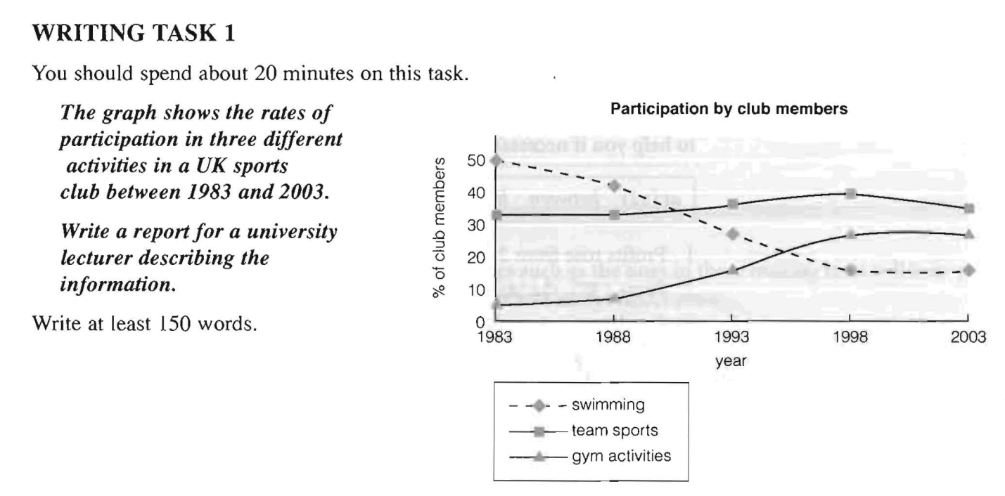 This graph shows changes in the popularity of three different activities in a UK sports dub over a period of 20 years. In 1983 around 50% of club members participated in swimming, so this was clearly the most popular activity. However, this figure decreased steadily to 15% in 1998 and remained constant off at this rate until 2003. In contrast, 32% of members did team sports in 1983, and this rate reached a peak of 40% in 1998 before dropping to its former level. Participation rates for team sports overtook those for swimming and became the highest for all activities from 1993 to 2003. Finally, participation in gym activities stood at only 5% in 1983, but this figure grew rapidly from 1988 to 1998, eventually levelling off at around 25%, making gym the second most popular activity. Overall, participation in swimming dropped considerably during the period. Team sports, however, remained popular, while participation in gym activities rose significantly over the period. 1.1 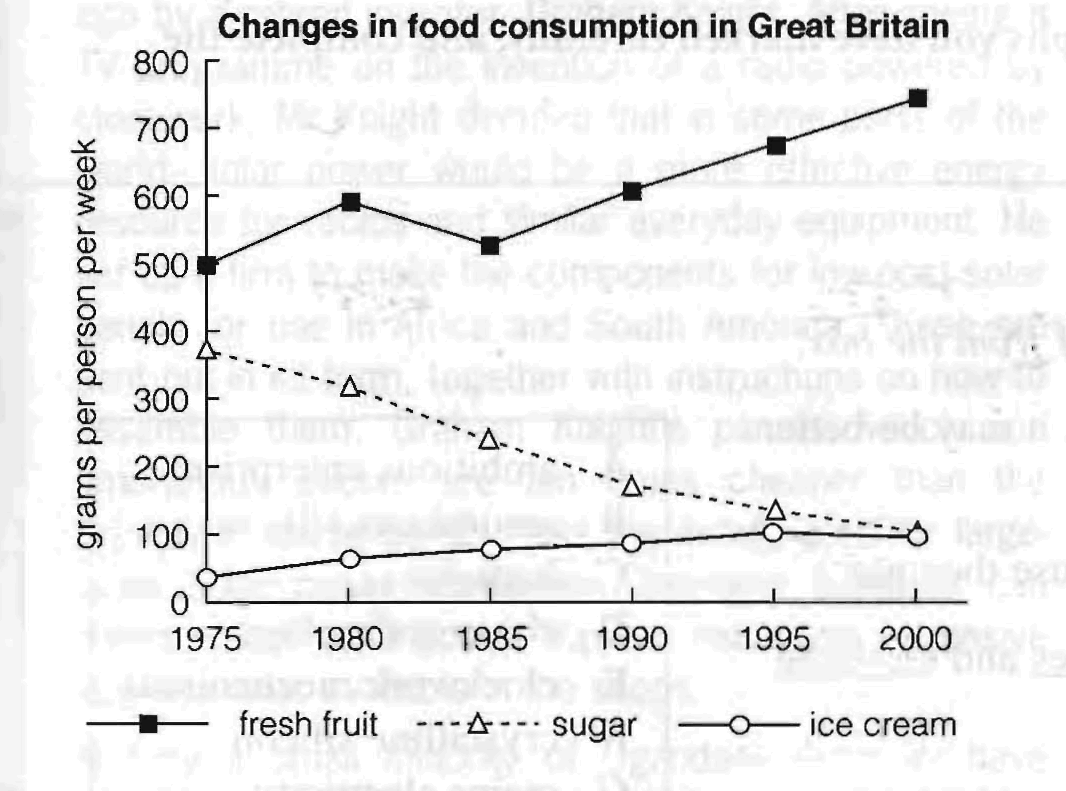 The graph shows changes in the amount of fresh fruit, sugar and ice-cream eaten per person per week in Britain between 1975 and 2000. People consumed more fresh fruit than either sugar or ice-cream throughout the period. In 1975, the consumption of fresh fruit stood at 500 grams, then increased to 600 grams in 1980. Although it dipped in 1985, it then rose steadily and reached 750 grams in 2000. In contrast, there was a consistent drop in sugar consumption. The amount consumed decreased steadily from almost 400 grams per person to only 100 grams by 2000. The amount of ice-cream consumed weekly started at about 50 grams. However, this gradually increased throughout the period. By 2000 it was at the same level as the consumption of sugar. From the graph we can see that overall, the consumption of fruit rose, while the consumption of sugar fell. In addition, the consumption of ice-cream, while at a relatively low level, rose significantly during this period. 2. Bar chart The bar chart gives information about the percentage of workers in different sectors of employment in three countries at different stages of economic development. 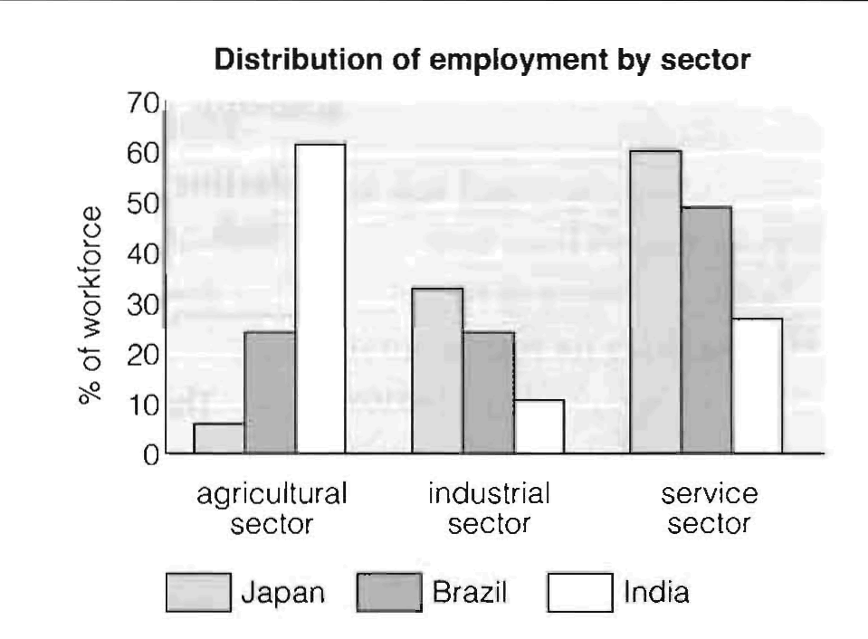 In Japan the highest proportion / the largest percentage of the workforce is in the service sector. India has many more people employed in the agricultural sector than either Japan or Brazil, but it has fewer workers in the industrial sector. Brazil has as many workers in the agricultural sector as it has in the industrial sector. In India, most people work in the agricultural sector. The majority of workers in Brazil are in the service sector. The lowest proportion of Japanese workers are employed in the agricultural sector. Of the three countries, Japan has the highest/largest percentage of employees in the industrial sector. Countries which have more developed economies seem to have a larger percentage of the workforce in the service sector. The chart compares proportion of the workforce employed in agricultural, industial and service sectors in three economically different countries. First of all, we can see that both Japan and Brazil have the the largest percentage of the workforce in the service sector (61% and 50% respectively). But while Japan has the fewest people employed in the agricultural sector with only 7% of the working population, an equal number of Brazilians work in the agriculture and industry sectors (25% in each). In contrast, we can see that the majority of the Indian workforce, amounting to 61%, is employed in the agricultural sector, the lowest percentage / smallest proportion of employees work in industry and the remaining 27% are in the service sector. Overall, the data indicates that countries with more developed economies have a higher proportion of workers in the industrial and service sectors than in the agricultural sector. 3. Pie chart The pie charts below show average household expenditure in Hong Kong and Britain in the year 2000. 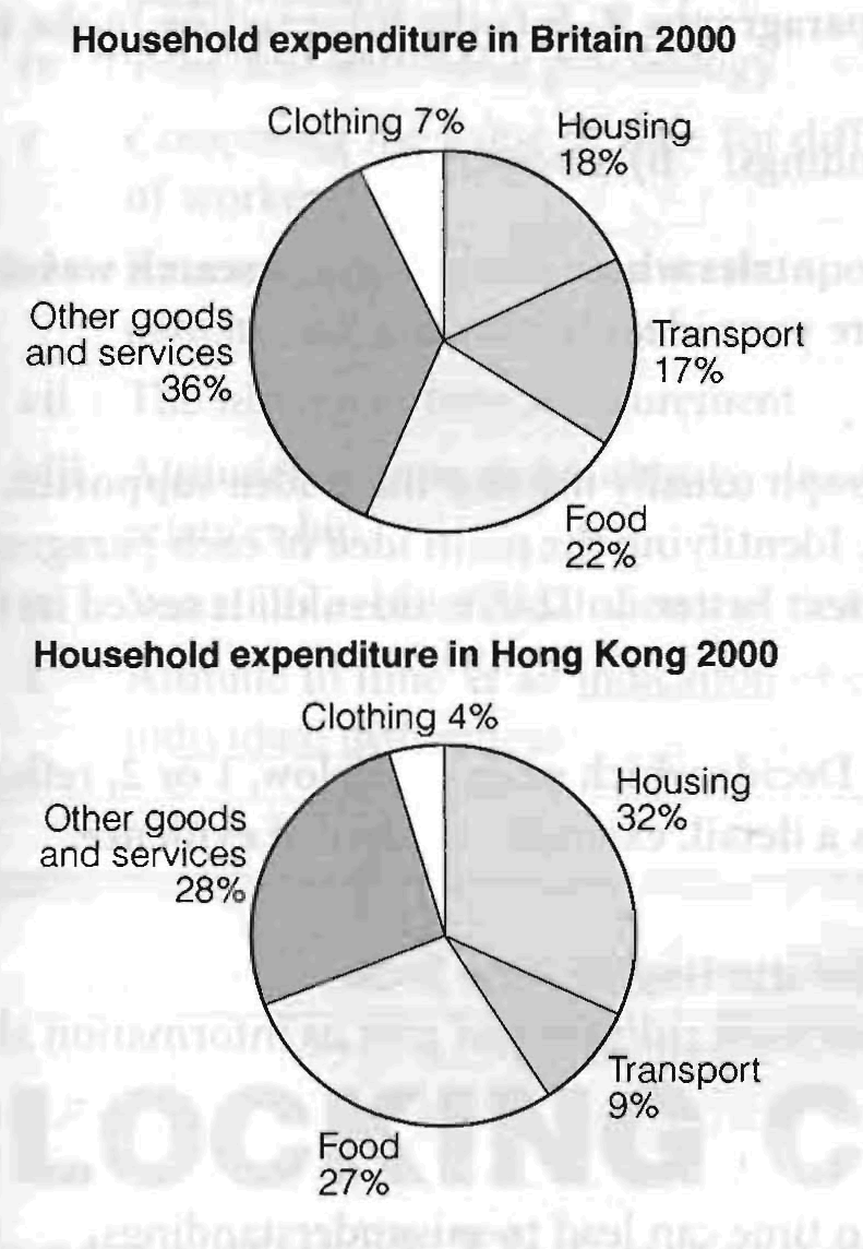 The pie charts show the proportion of money spent on various household expenses in Hong Kong and Britain in 2000. We can see that in Hong Kong the greatest proportion of expenditure (32%) was on housing, while in Britain housing accounted for just 17% of the total. In contrast, in Britain the greatest single expense was other goods and services at 36%, compared with 28% in Hong Kong. Food came in second place in Britain, at 22%, while in Hong Kong the actual proportion was higher (27%). In Britain another major expense was transport, at 17%, but this was much lower in Hong Kong (9%). In both countries the smallest percentage of expenditure was on clothing. Overall, the data indicates that in both cases food, housing and other goods and services were the main expenses, but that in Britain, transport and other goods and services took up a higher proportion of total expenditure than in Hong Kong. 3. Table The table below gives information about the daily cost of water per person in five different countries. (Figures are based on the minimum daily requirement per person of 11.5 litres.) Cost of minimum daily water requirement by country
The table compares the amount people have to pay for their minimum daily water in five countries. It also shows the percentage of the average daily wage this represents in each place. First of all, we can see that Tanzania and Uganda have the highest daily water costs while/whereas the UK and US have the lowest. This means, for instance, that Tanzanians pay 6.4c whereas/while Americans pay a mere 0.85c for the same amount of water. These differences are even greater when we consider the percentage of the average daily wage this cost represents. In both Tanzania and Uganda, the cost is significant, representing 5.7% and 3.2% respectively. In the UK and US, however, the cost is only a tiny fraction of the daily wage at 0.013% and 0.006%. And, despite the daily cost of water in Pakistan being similar to that in the UK, it represents as much as 1.1% of the daily wage. Overall, the table shows that there are huge differences between the cost of water in the developing countries and the industrialised west. 3.1 The table below gives figures for student applications and acceptances for UK university courses in the field of tourism, transport and travel. Student statistics for university courses in tourism, transport and travel, 2000-2002
The table concerns university courses related to tourism, transport and travel in the UK. It shows changes in the numbers of male and female students applying for and being accepted on such courses between 2000 and 1002. Firstly, we can see that with regard to applications, in all three years, more men applied for such courses than women, although their numbers fell / declined / decreased / went down considerably, from 3,400 in 2000 to 2,750 in 2002. Female applications reached little more than a quarter of the figures for men in 2000 and 2001, and they fell / declined / decreased / went down to 750 in 2002. Total applications fell / declined / decreased / went down during the period. In terms of acceptances, many more men and women applied for these courses than were accepted throughout the three years. However, the percentage of applications which were accepted rose/grew/increased/went up from about 15% in 2000 to over 21% in 2002, even though the total number rose / grew / increased / went up only slightly. Overall, many more men were accepted than women in all three years. While total applications fell / declined / decreased / went down, the percentage of those accepted rose/grew/increased/went up considerably. 3.2 The table below gives information about the use of different modes of transport in Shanghai in 1996, and one possible projection (high motorisation scenario) for their use in 2020. Percentage of passenger kilometres by different modes of transport in Shanghai
The table predicts changes in the types of transport used in Shanghai between 1996 and 2020. The figures show that in 1996 the most popular form of transport was public bus, accounting for 39% of passenger kilometres. This was followed by bicycles with 27% whereas cars and scooters were used less, representing only 15% and 12% of passenger trawl respectively. Predictably, walking made up the smallest percentage. It is expected that in 2020 the use of cars will increase dramatically and account for over half of all distance travelled (52%). In addition, trains will probably account for 13% of passenger kilometres, while the use of all other means of transport will decrease, bus journeys, for example, will only represent 22% of distances travelled, while bicycle trips will drop to as little as 3%, similar to the figure for walking. Overall, the table predicts a massive increase in the use of cars by 2020, at the expense of other forms of transport. ASSESSMENT OF WRITING TASK 1. The graph below gives information about changes in the birth and death rates in New Zealand between 1901 and 2101. Write a report for a university lecturer describing the information shown below. Write at least 150 words. Birth and death rates in New Zealand 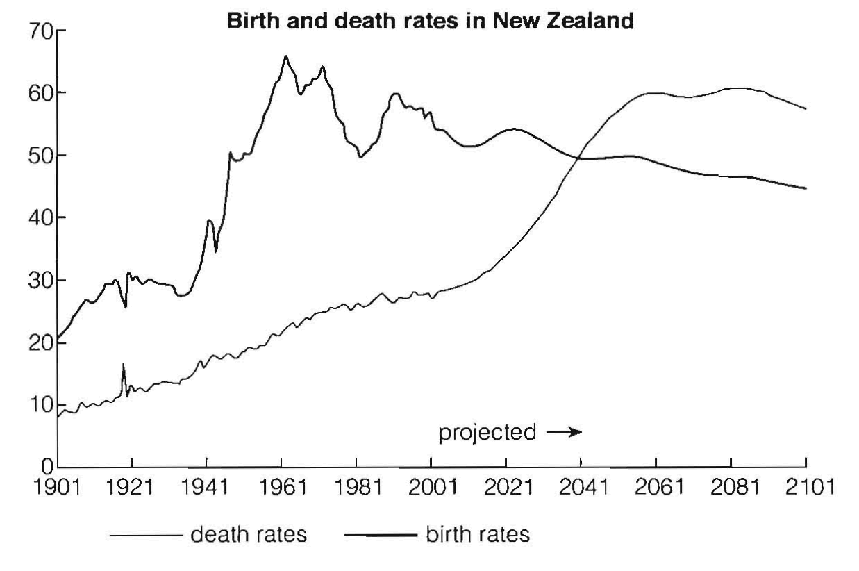 Sample answer A The graph gives information about changes in the birth and death rates in New Zealand between 1901 and 2101. In 1901 the birth rate was 20,000 and the death rate was 9,000. \n 1961 the birth rate reached a peak of 66,000 while the death rate was 23,000. In 2001 there were 55,000 births and 38,000 deaths, and in 2061 there were 60,000 deaths and 48,000 births. At the end of the period there were 58,000 deaths and 45,000 births. Both the birth and death rates changed between 1901 and 2101. Perhaps this was because a lot of people did not want to have children. (105 words) Assessment This is a weak answer. Problems: • underlength • introduction is copied from task • no comparison between figures • no focus on general trends • no reference to the future (see projection on graph) • conclusion tries to explain information rather than summarise it • poor linking of ideas (only done by time markers) • limited range of grammar and vocabulary Sample answer B The graph shows changes in the birth and death rates in New Zealand since 1901, and forecasts trends up until 2101. Between 1901 and the present day, the birth rate has been consistently higher than the death rate. It stood at 20,000 at the start of this period and increased to a peak of 66,000 in 1961. Since then the rate has fluctuated between 65 and 50 thousand and it is expected to decline slowly to around 45,000 births by the end of the century. In contrast, the death rate started below 10,000 and has increased steadily until the present time. This increase is expected to be more rapid between 2021 and 2051 when the rate will probably level off at around 60,000, before dropping slightly in 2101. Overall, these opposing trends mean that the death rate will probably overtake the birth rate in around 2041 and the large gap between the two levels will be reversed in the later part of this century. (166 words) Assessment This is a strong answer which would score a high IELTS band: Good points: fulfils criteria for length introduction is paraphrased. main sets of data are compared and contrasted clear focus on the different trends. important features of the graph, (e.g. cross-over point) included information summarised in conclusion well organised information range of linkers and referencing expressions good range of vocabulary and structures, used accurately | |||||||||||||||||||||||||||||||||||||||||||||||||||||||||||||||||||||